Identity in Practice
Translating brand principles in everyday customer experiences
Translating brand principles in everyday customer experiences
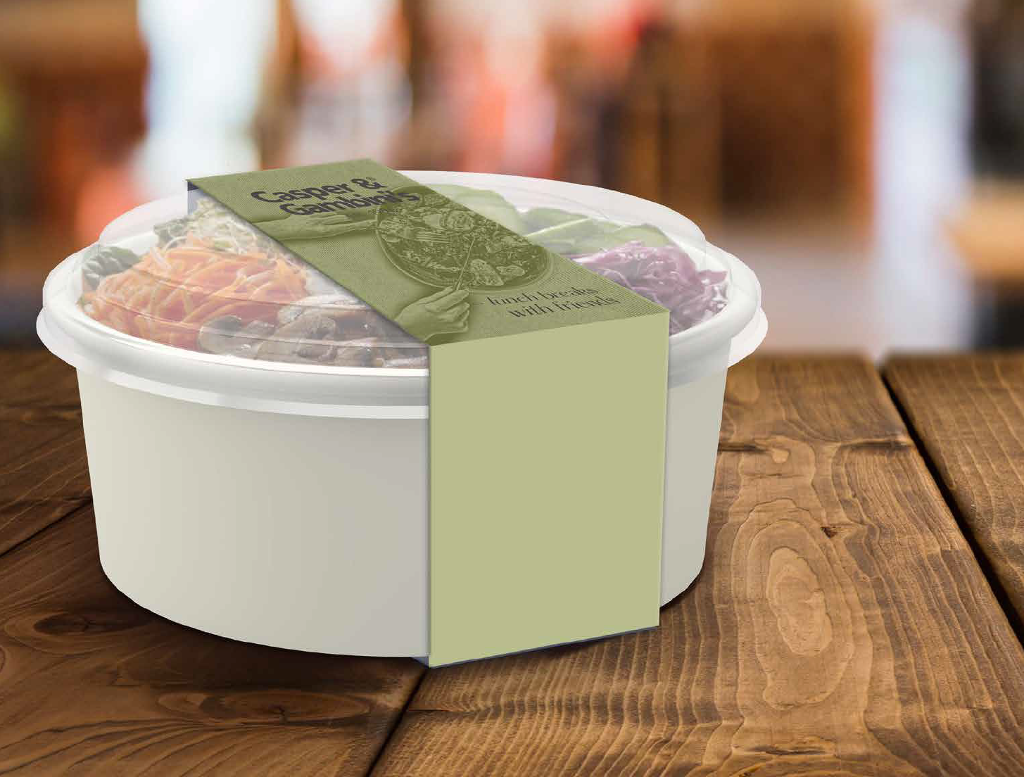
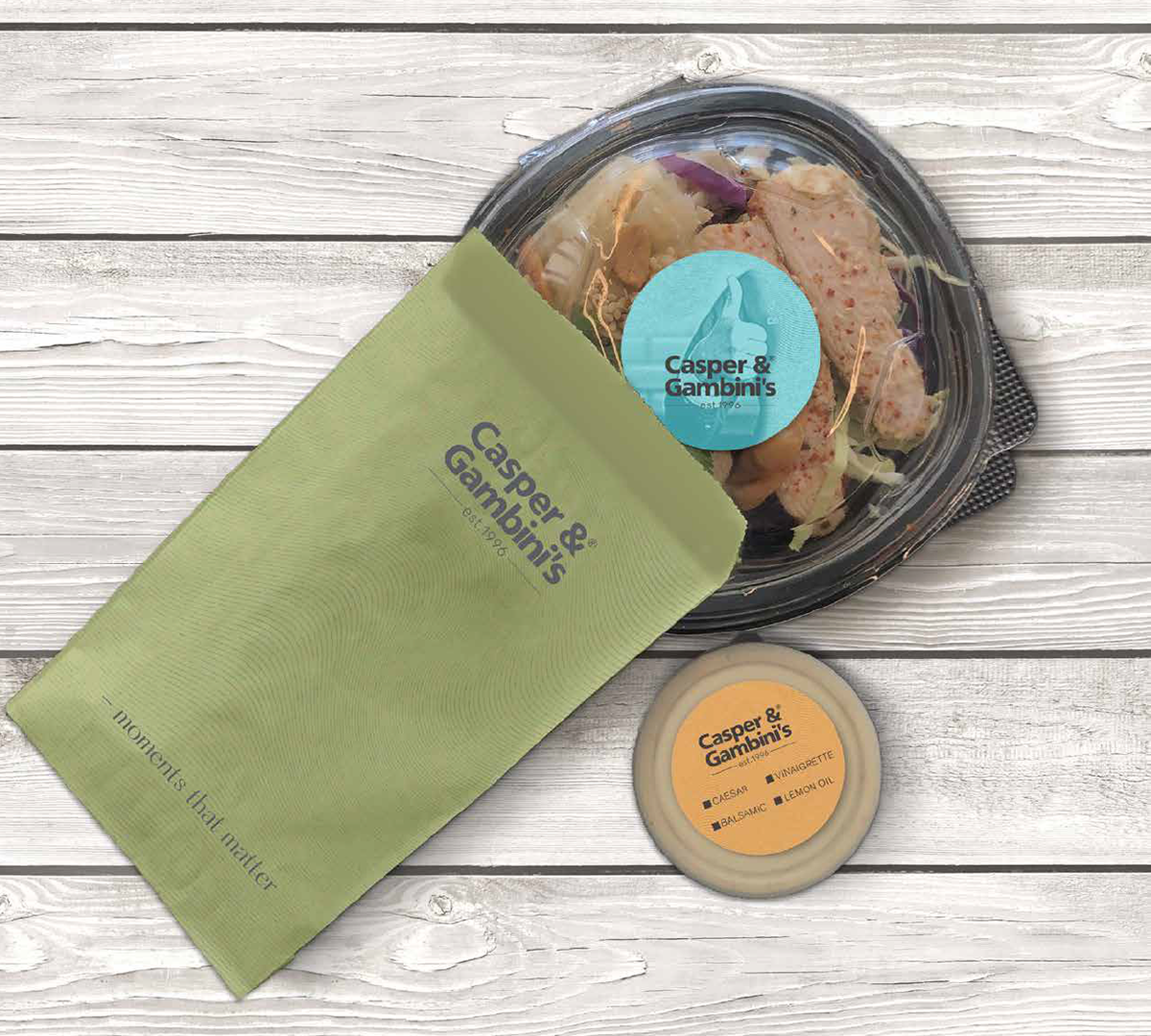
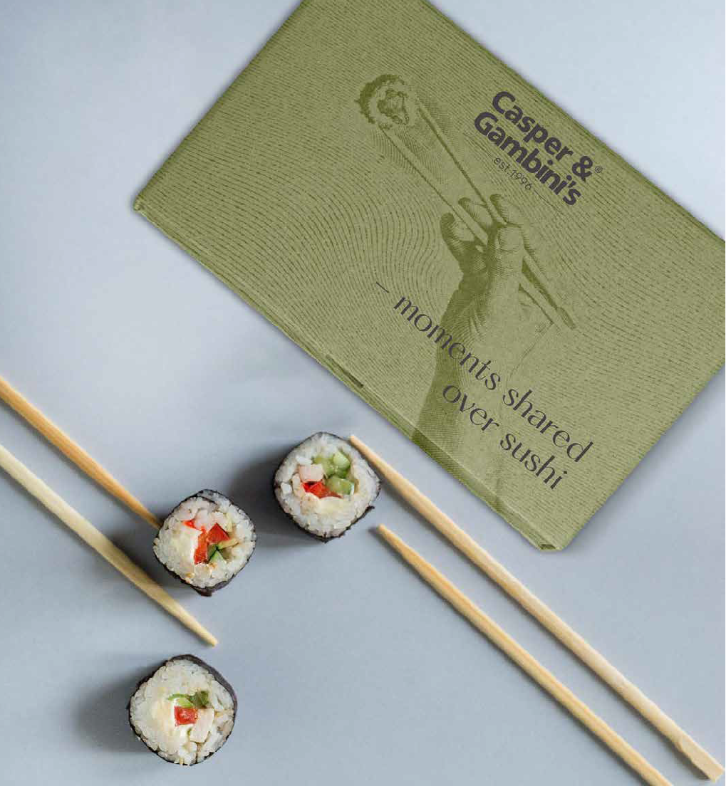
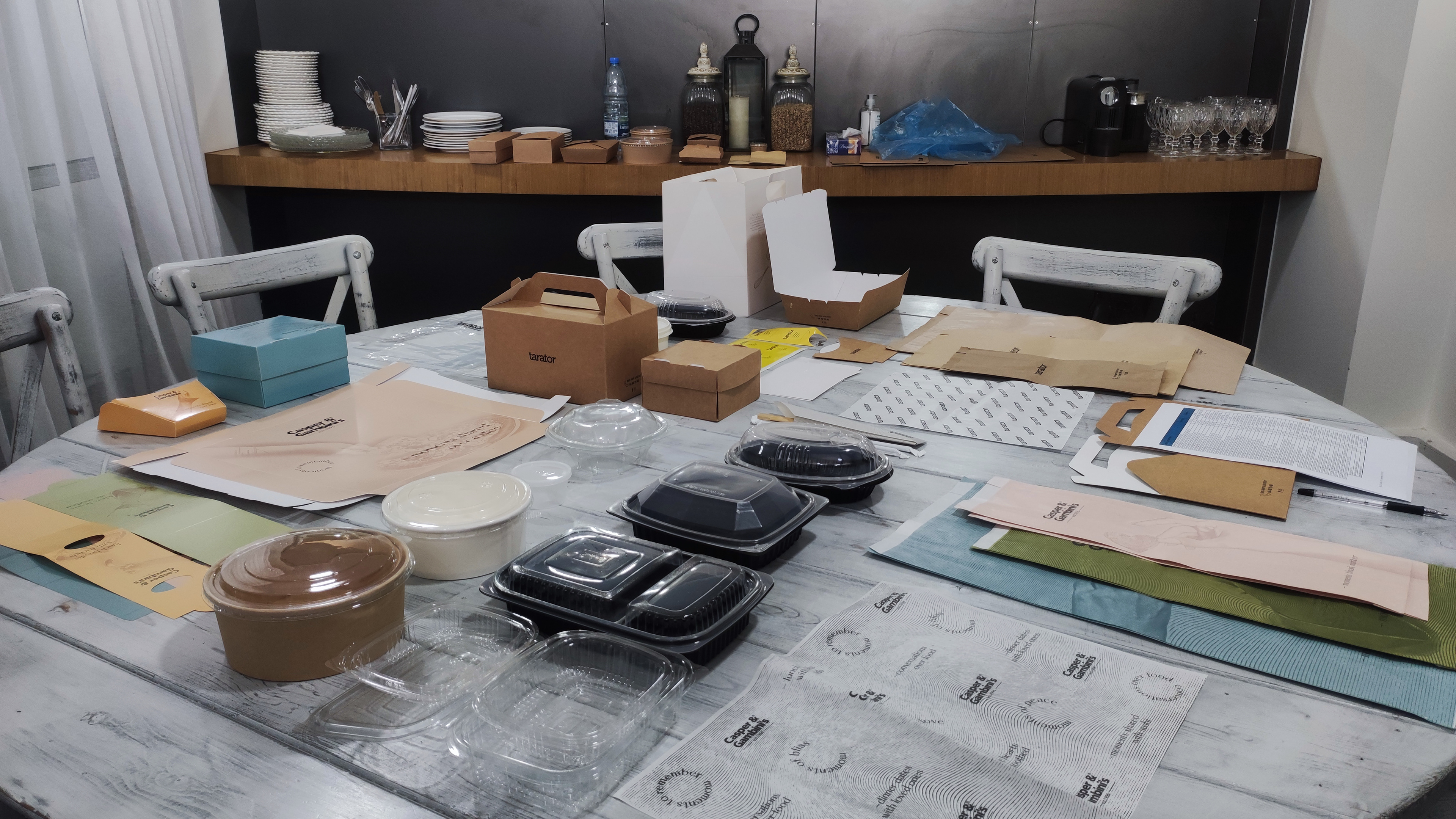
A visual identity begins as a set of principles, but it only becomes a brand when it is applied consistently across everyday experiences. Working within Casper & Gambini's evolving identity, the focus was not on creating new visual assets, but on interpreting and extending an existing system across menus, packaging, and the restaurant environment.
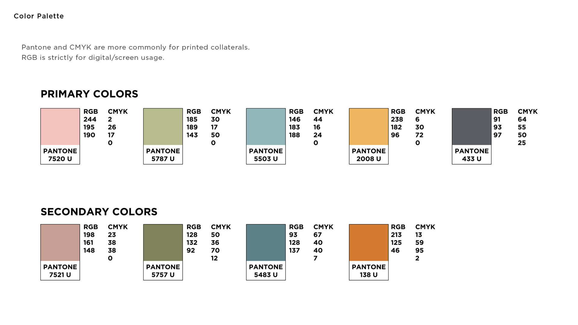

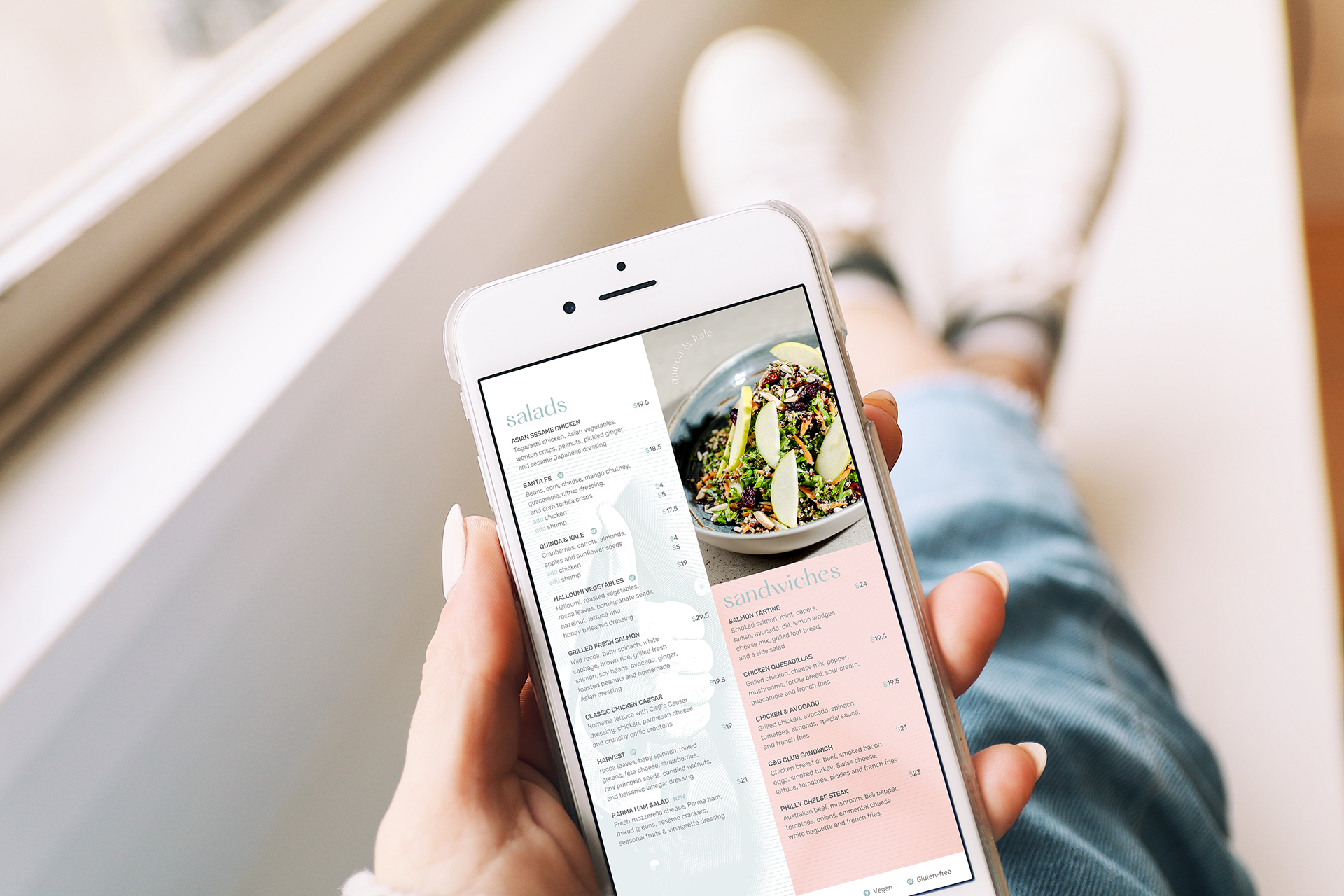
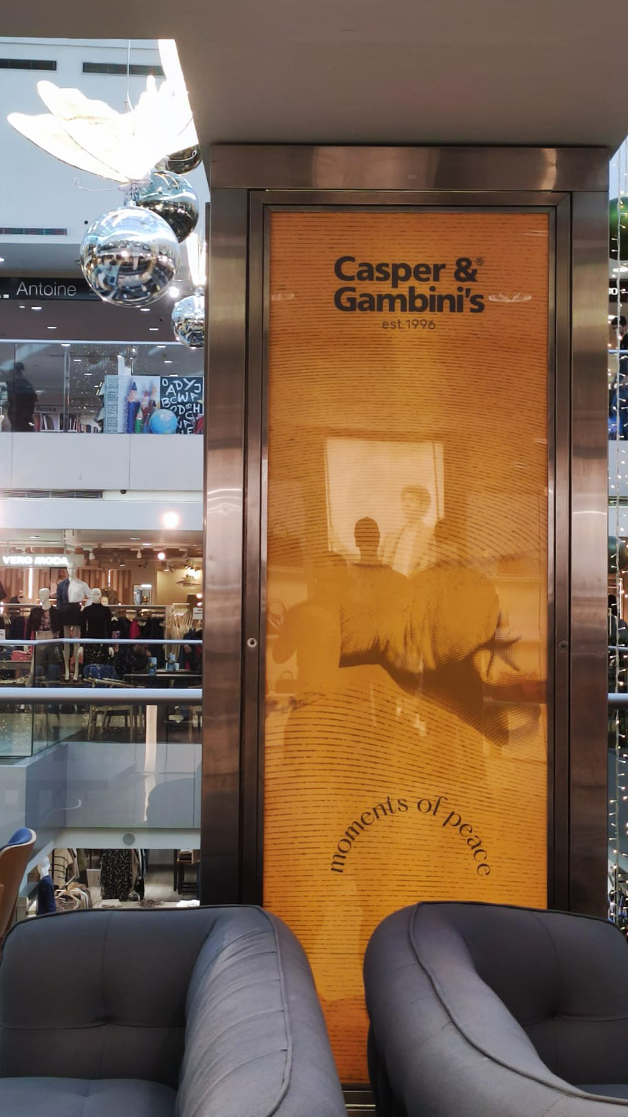
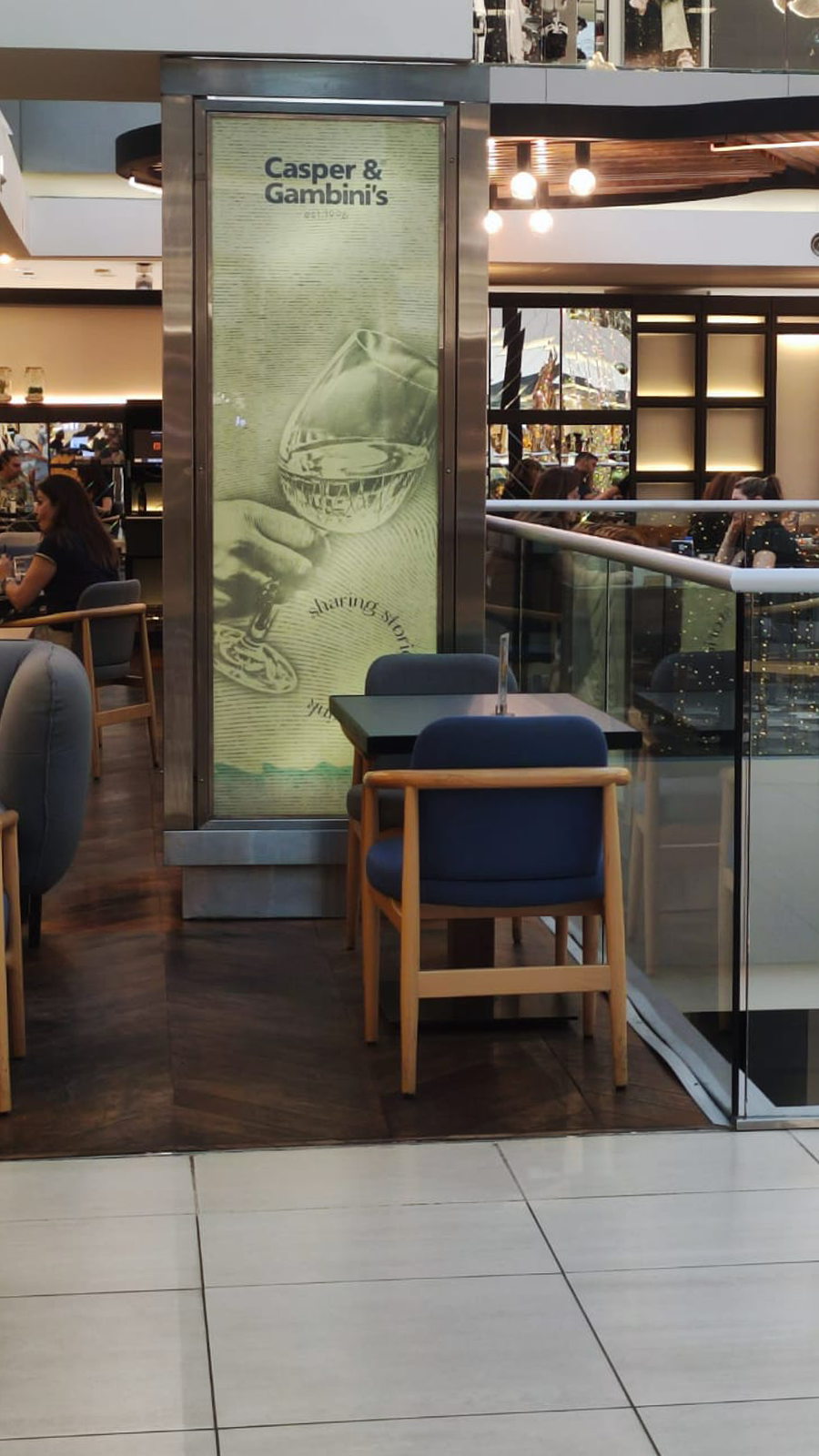
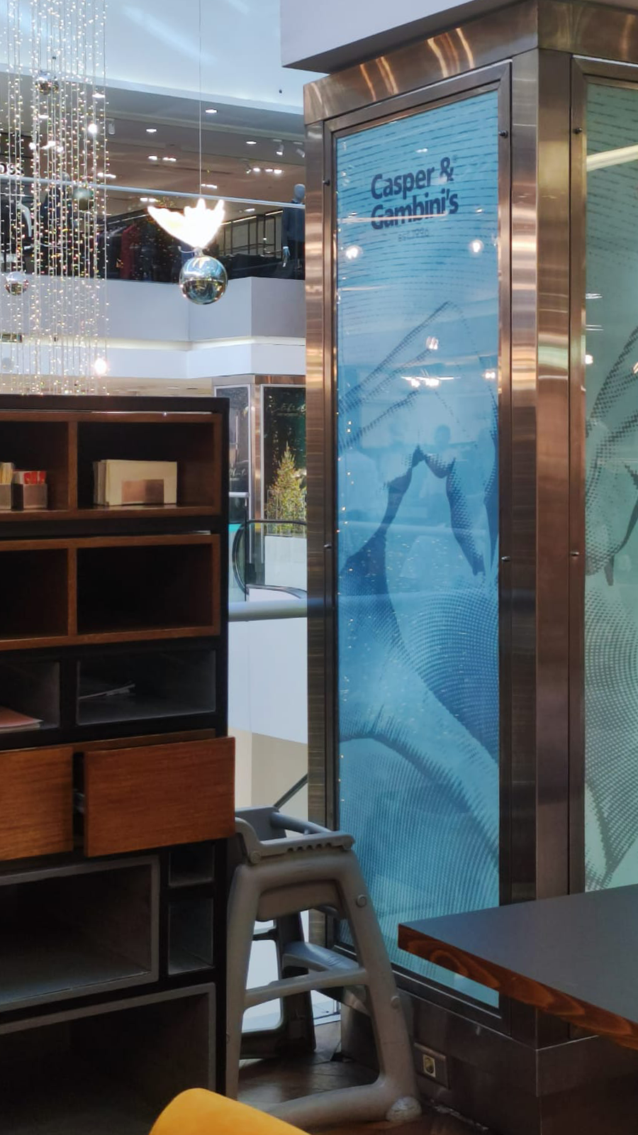
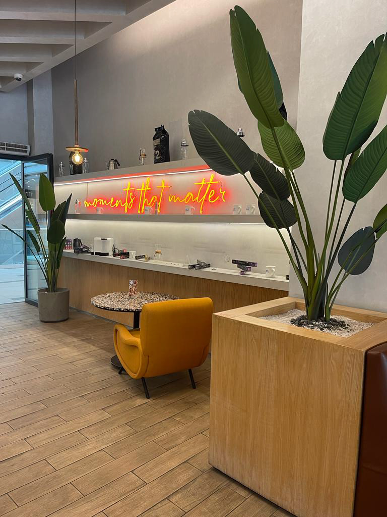
Every identity eventually reaches the moment where design meets reality. Production, cost, procurement and day-to-day operations reveal constraints that are impossible to see in mockups alone. Materials behave differently, budgets introduce new priorities, and operational requirements begin to shape design decisions. Rather than treating these constraints as compromises, they became an opportunity to reconsider how the identity could be expressed in ways that remained practical without losing its character.

Thinking Beyond the Brief
The most valuable design opportunities are not always written into the brief. Some emerge through observation—recognising patterns, inconsistencies or possibilities that become visible only after spending time inside an organisation. Working across several hospitality brands created opportunities to question existing systems, propose alternative directions and introduce ideas that extended beyond the immediate requirements of individual projects. Not every proposal was implemented, but each contributed to a deeper understanding of how design can support an organisation over time.

A Temporary Identity
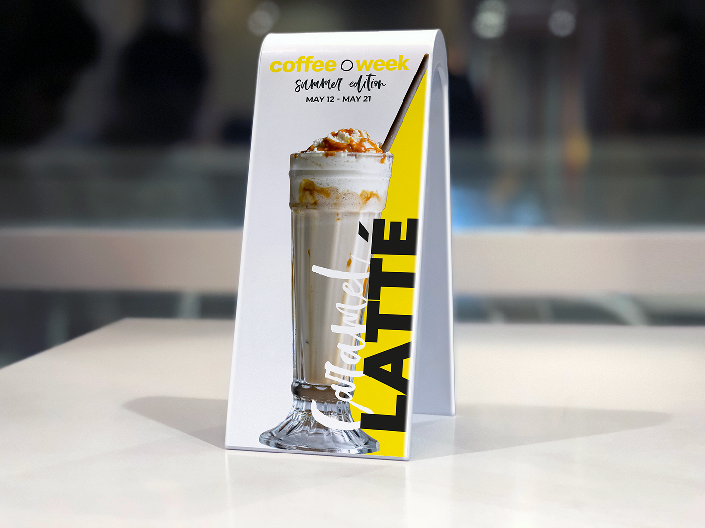
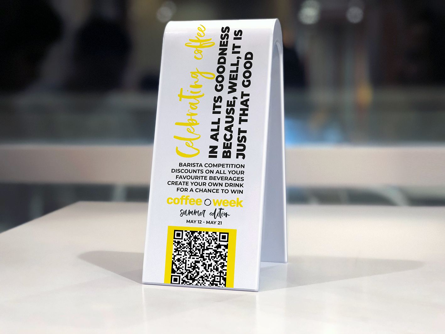
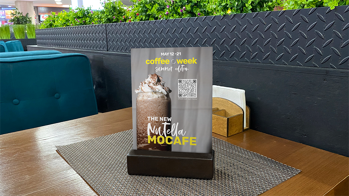
Coffee Week explored how a temporary event could be given its own visual identity through typography, colour and a playful graphic language. Rather than relying on the parent brand for recognition, the project developed a distinct visual character that could extend across promotional material, printed collateral and the café environment while creating a memorable identity for the event itself.

Evolving an Identity
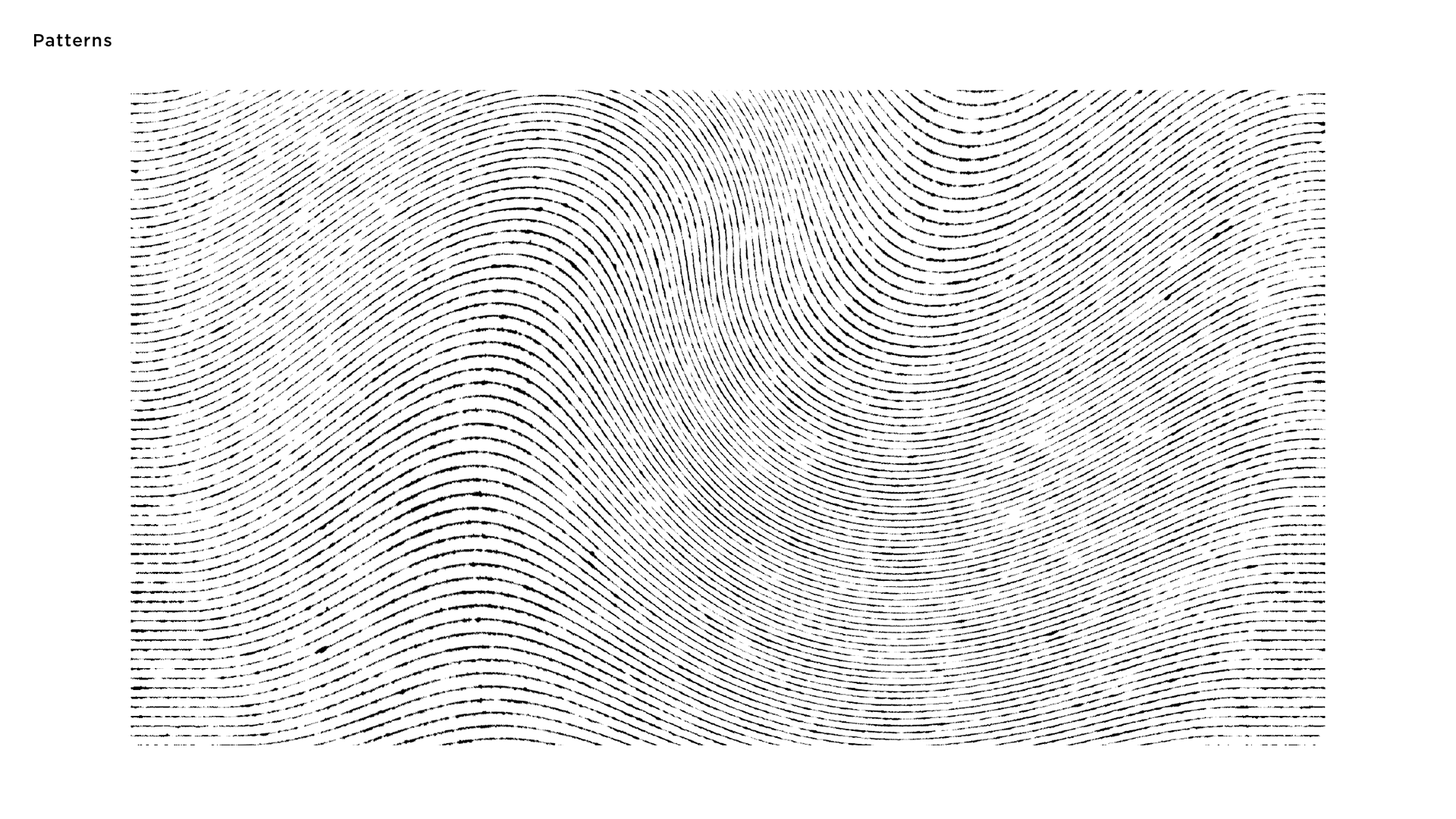
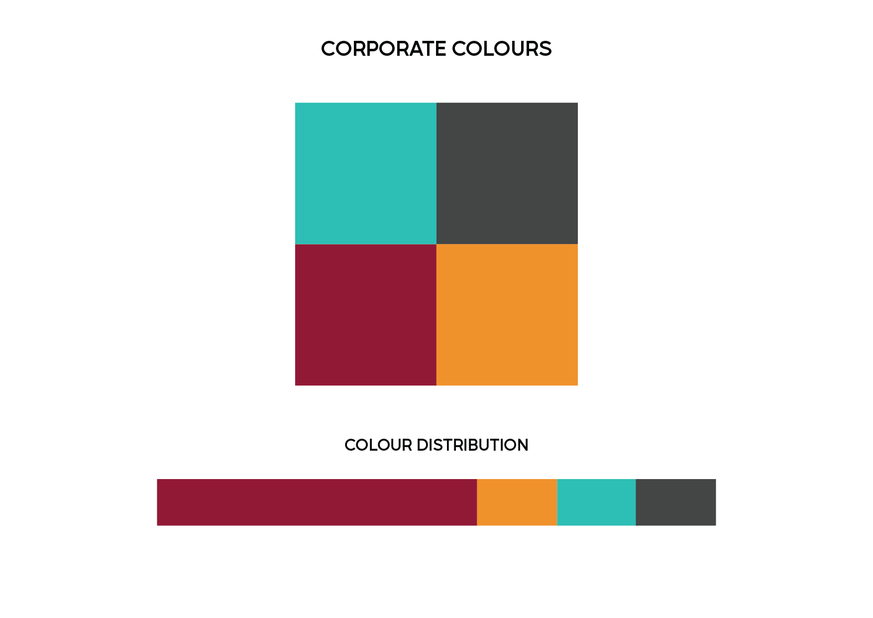
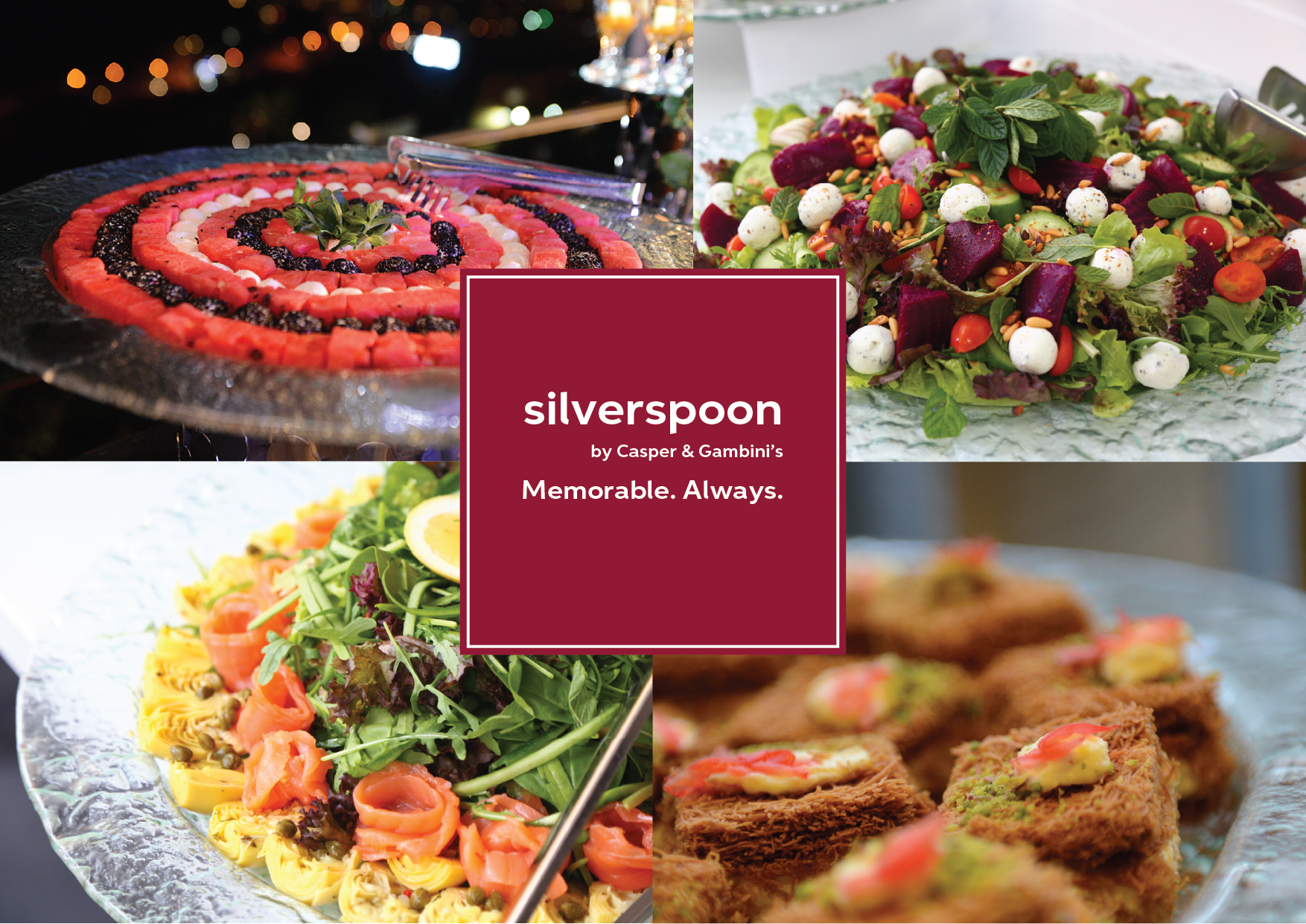
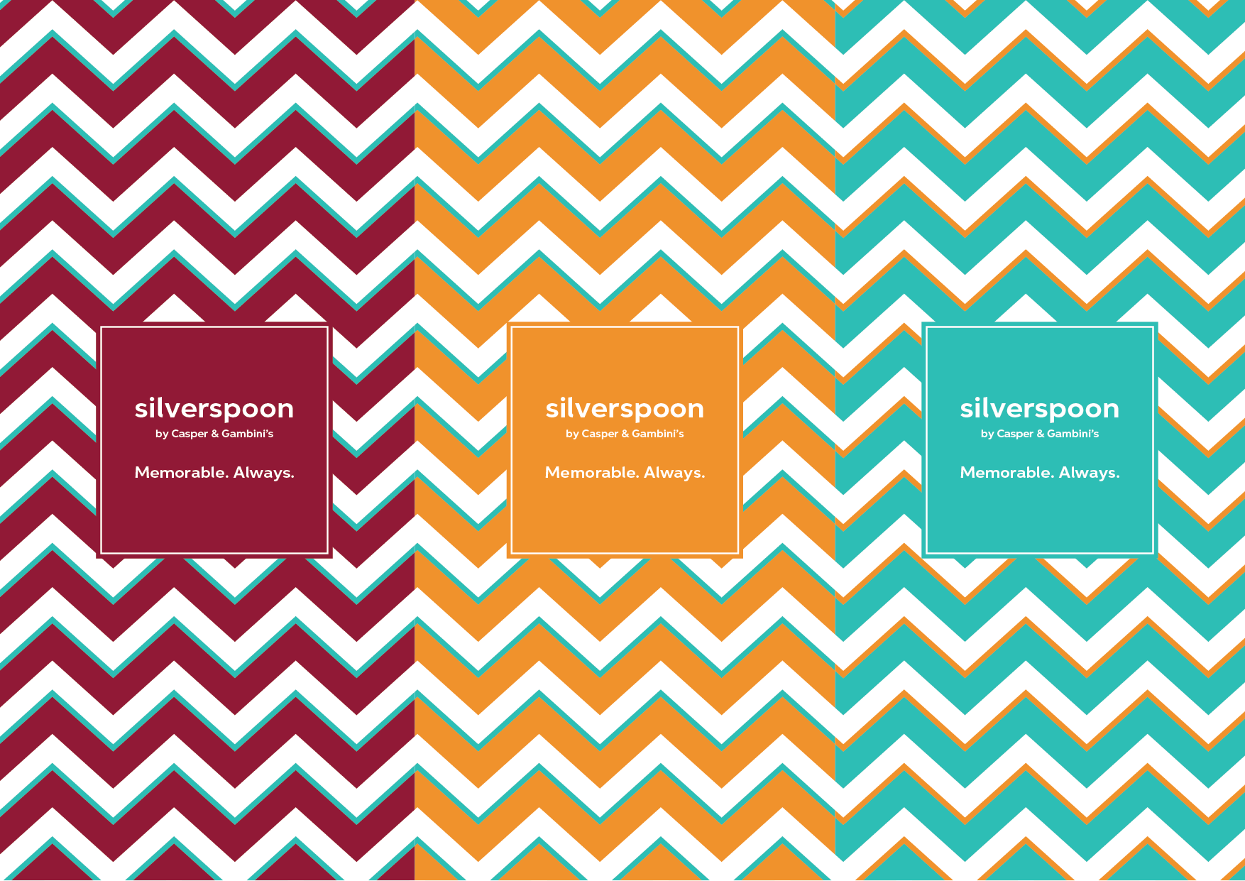
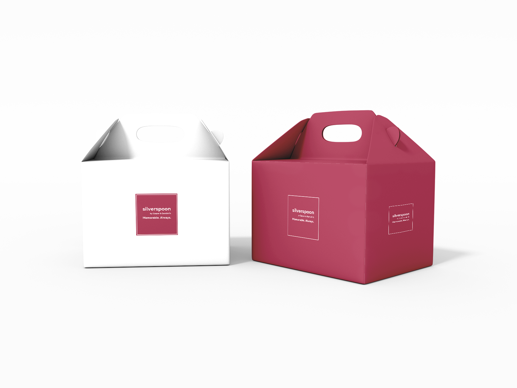
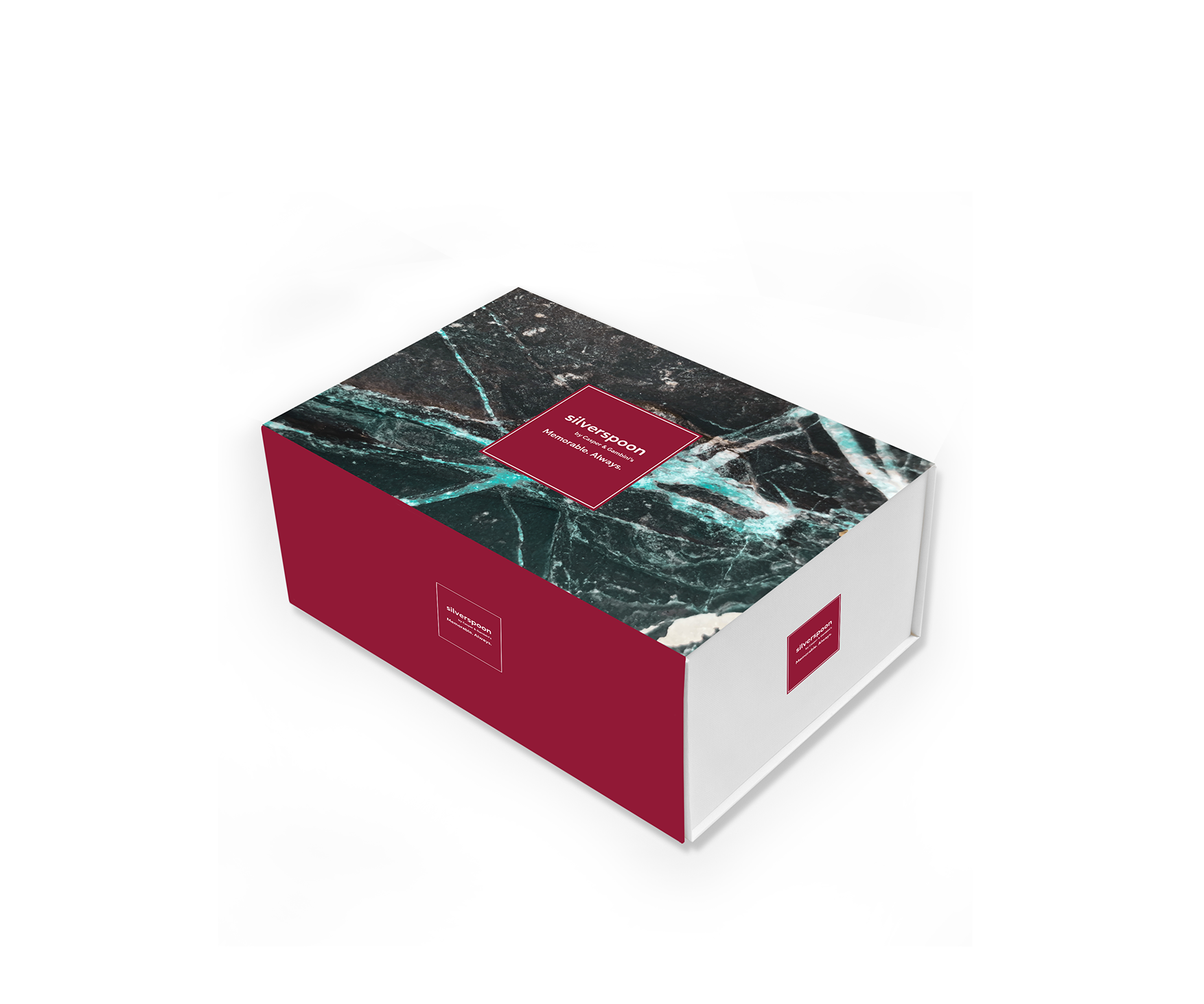
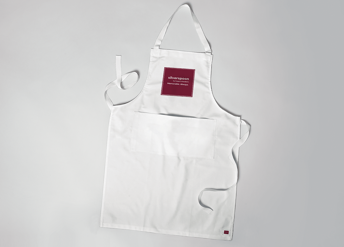
Silverspoon had established itself as a trusted catering service, yet its visual identity remained largely undefined. Beyond a wordmark and two shades of blue, there was little to shape how the brand communicated across packaging, print, or the wider customer experience. Rather than proposing a complete reinvention, this exploration asked how the identity might gradually mature. A warmer palette, considered typography and a family of graphic patterns introduced greater character while remaining practical enough for everyday use. The proposal imagined an identity that could grow alongside the reputation the business had already earned.

Designing for the Shelf
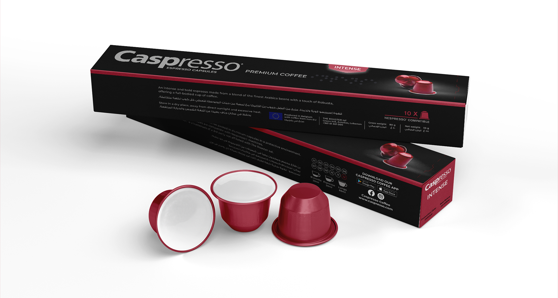
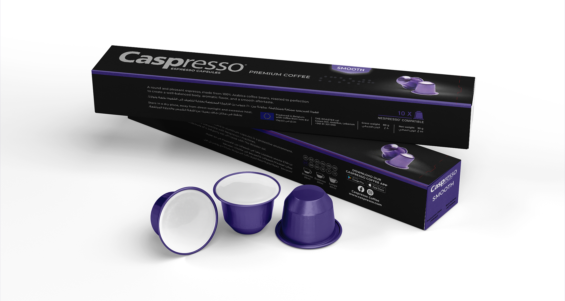
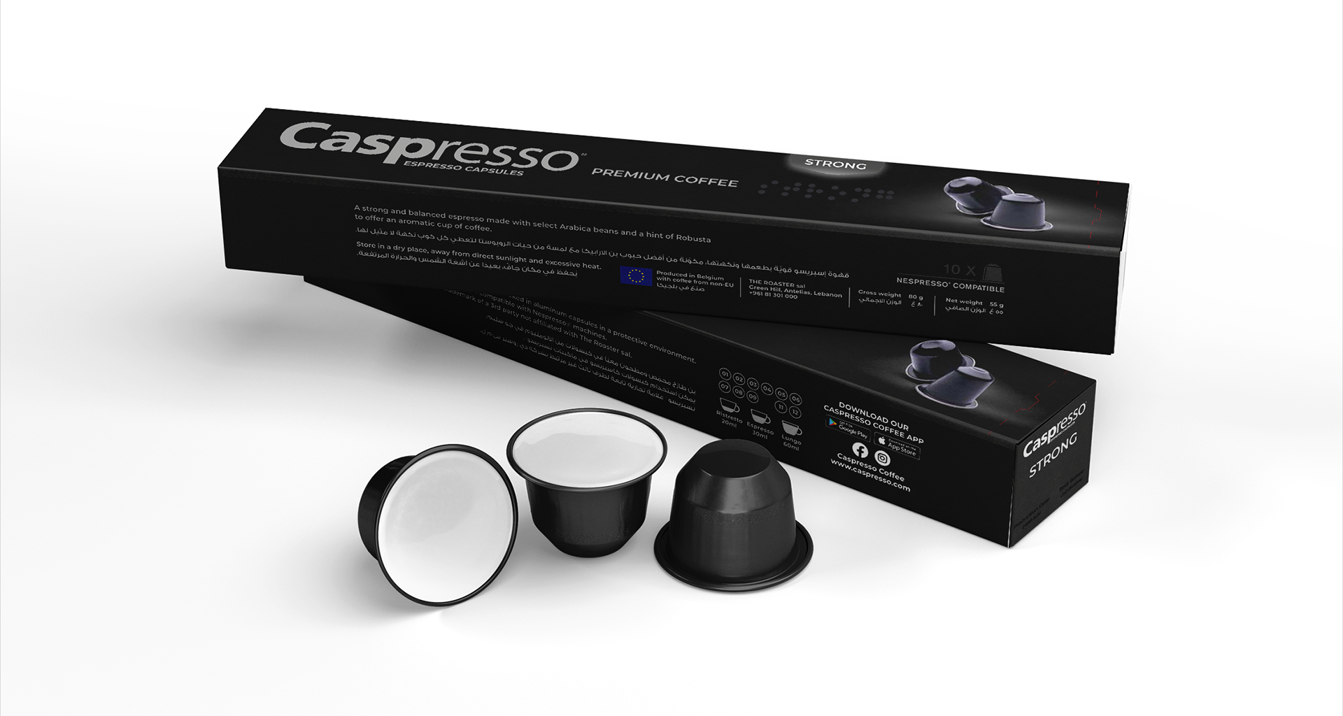
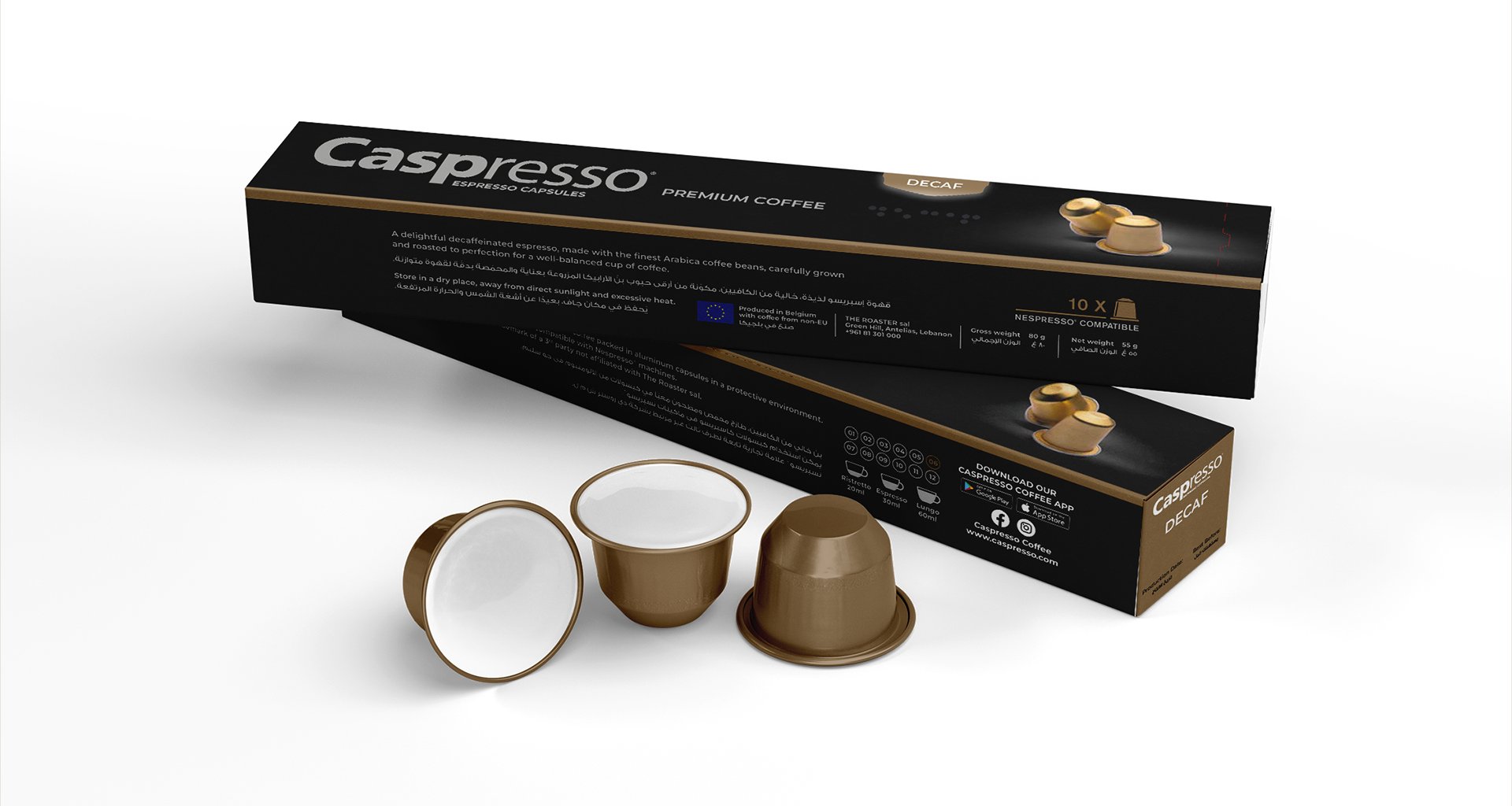
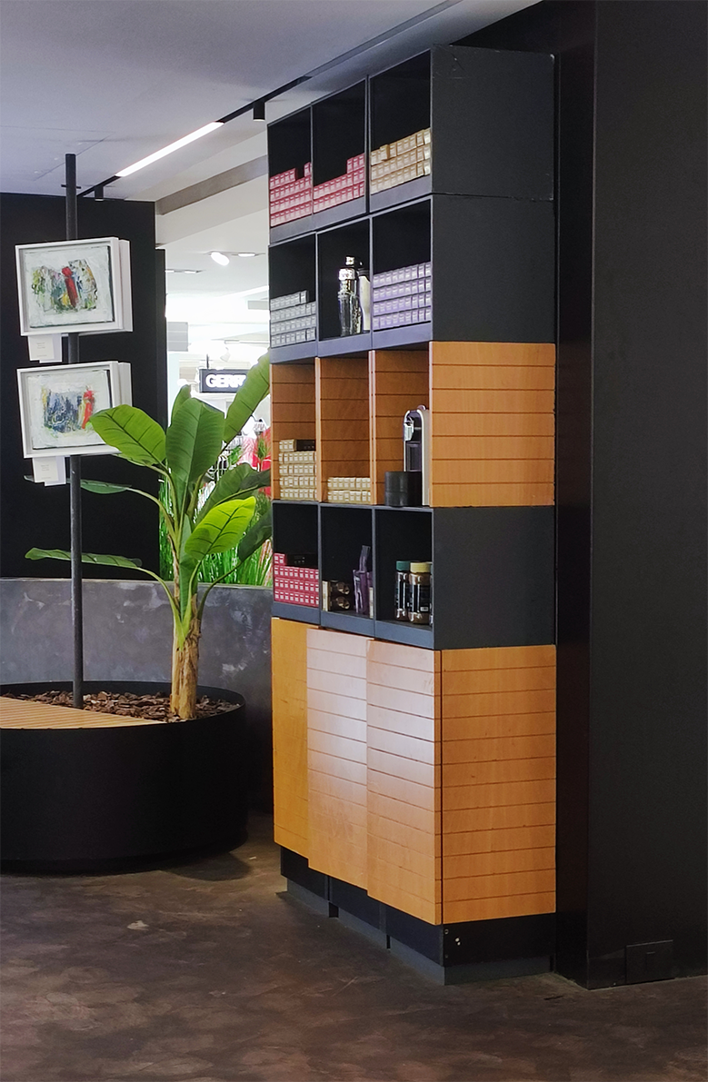
Retail packaging demands a different kind of precision. Every surface must communicate clearly while accommodating technical requirements such as nutritional information, ingredients, barcodes and production specifications. This redesign refined the existing Caspresso capsule packaging, simplifying its visual language while improving hierarchy, legibility and overall coherence. Rather than reinventing the identity, the work focused on making an established product feel more contemporary without losing the familiarity customers already recognised.
Existing Design
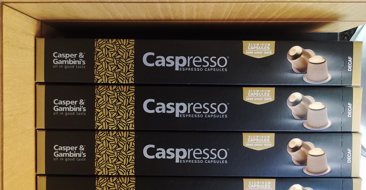
Redesign